A recent article
presents a font by Ken Perlin that, as the article claims, is the smallest
legible one. Of course, I'm no one to challenge him in his core field --
but, a font I created in 2004 for side messages in a MUD client is smaller:

The same sample provided there in a 320x240 rectangle:
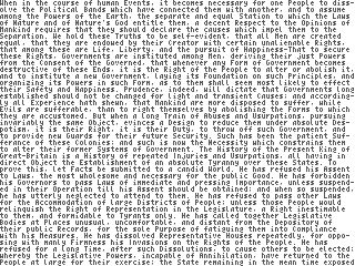
Also, my font is fixed pitch as I needed it to be that rather than proportional, so you can shave quite a bit more. It is also far more legible -- especially when enlarged:
| Ken Perlin's |  |
| my attempts |  |
As you can see, the former uses sub-pixel rendering, which breaks the moment the image is resized, rotated or shown on a non-LCD screen.
Being a good bit older than when I made this, I'd say that using such tiny
fonts put an unnecessary strain on your eyes and thus should be avoided.
But if you want to use this -- go ahead, in most jurisdictions bitmap fonts
are not copyrightable, and if not:
© 2004 Adam Borowski. You may freely use, modify and/or distribute this
font for any purpose whatsoever, with or without a fee.